2026-11-06
AI game art styles: from a good-looking image to a consistent game
A beautiful AI image is a starting point—not a finished art direction. A game needs characters, environments and props that look as though they belong together. The useful question is not just “Which style looks best?” but “Can I make a playable world in this style?”
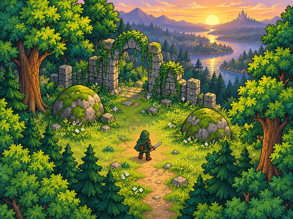
1. Compare styles using the same subject
The GenioPlus style library shows the same adventurer and forest setting across different visual treatments. Compare top-down tile pixel art, watercolor and low-poly before changing the subject. Look at silhouette, camera angle, edge softness and background detail—not just how impressive the image feels.
For a small-screen game, check whether the character remains readable at gameplay size. For a tile-based game, think about repeatable terrain and camera alignment. Choose a direction your game can actually use.
2. Write a short style brief
Fix five decisions: camera, palette, shapes, lighting and detail level. “Pixel art” alone leaves too much open. “Top-down view, muted greens, compact silhouettes, upper-left light, restrained texture” gives you a more useful starting point. Save an approved image as a reference when your chosen tool supports it.
3. Reuse the style, change the subject
Try this prompt as a starting template. Replace the SUBJECT line for each asset and adjust the style rules to your project; it is not a promise of pixel-perfect output.
SUBJECT: A small wooden treasure chest with iron hinges.
STYLE: Top-down 2D pixel-art RPG asset, three-quarter view.
PALETTE: Muted forest greens, warm browns, pale cream highlights.
SHAPES: Clear silhouette, compact proportions, restrained texture.
LIGHTING: Soft light from the upper left; one consistent shadow direction.
COMPOSITION: One centered object, fully visible, no text, no watermark.
BACKGROUND: Plain contrasting background for later extraction.
CONSISTENCY: Match the approved reference's palette, edge treatment,
camera angle and level of detail. Do not add a different art style.
The library provides separate prompts for characters, tilemaps and scenes. Use the one that fits your task: a scene prompt describes a complete background, not a ready-to-import collection of isolated props. Scene extraction comes after you have an image.
4. Test a tiny asset family first
Generate one character, one tree and one chest. Place them on the same background at their intended in-game sizes. Check perspective, scale, contrast and shadows. If they clash, revise the brief before producing more assets.
Where supported, image references can help guide the look; see Adobe’s style-reference guide. They do not guarantee identical results. Keep the model and available settings consistent, and review each output rather than relying on the prompt alone.
5. Check the assets inside the game
A pixel-art look is not necessarily a clean pixel grid. Inspect edges, stray pixels and fine detail at native resolution. Check transparency after background removal, tile seams when repeating terrain, and silhouettes during animation. Attractive concept art may still need editing before it becomes a usable sprite.
Start with a small coherent set, test it in your engine, then expand. AI is most useful here as a way to explore and iterate—not as a substitute for choosing an art direction.
Find a visual direction for your next game.
Explore the game art style library →